
Why the football data debate doesn’t need to be so polarised

Resistance to change is normal. There’s often a fear of the unknown and moving away from what you’re used to is something very few are comfortable with. This is perhaps why there’s a refusal from some to accept a number of modern-day metrics used for analysis.
Over the last decade, football data has become more accessible. The understanding of it all is much greater and, as a result, we’re now seeing mainstream media adopting more detailed metrics for their analysis. The more it happens, the more people who are ‘anti-stats’ seem to dig their heels in.
You often hear phrases such as “football isn’t played on paper” and “excel sheets can’t win you games”. Moments later, these same people will claim that a player should’ve scored that chance or that a team look off the pace. These are statements that can be backed up quite easily with data.
The issue seems to be the terminology.
Peter Crouch referenced it on his podcast recently: “The phrase expected goals is pretentious. It makes me feel physically sick.”

The Expected Goals (xG) metric has been topical as of late following Brighton’s misfortune in front of goal. The Telegraph recently published an opinion piece and the general premise of it was that the obsession with data was pointless and that goals are the only way to judge teams.
On an episode of Twenty3’s very own Laptop Gurus podcast, Sky Sports pundit Jamie Carragher made the case for xG and confirmed it is one of his favourite stats.
“The one I look for the most is xG. That tells me who has had the biggest chances and who should’ve won the game based on the chances they had and that is all it is basically is. People who don’t like it are getting it tangled up in something it is not. It’s a pretty basic metric to look at to decide who has had the best chances in the game.”
Look beyond the name and this stat, as Carragher says, simply tells you which team had the better chances. During those post-match discussions in the pub (sadly, not so much recently), online or with friends, we’ve probably all, at some point, reeled off a list of opportunities our team had to win the game—xG is that, but in a quantifiable way.
Expected Assists (xA) is another one. It essentially shows how creative a player is. Assists are generally a flawed metric in the sense a player could punt the ball 60 yards and then a team-mate scores a wonder goal. They’re awarded an assist, but it has nothing to do with creativity. The xA stat gives a value to the chances a player has created. It acknowledges those players who are “robbed of an assist” thanks to a poor finish.
Jack Grealish recently referenced it in an interview. Again, the name of this metric might antagonise people, but what it highlights is invaluable when looking to analyse. It’s why players, such as Grealish, are so bought into it.
Another metric that is divisive yet really useful is PPDA. It stands for passes per defensive action and tends to be used when people want to highlight teams who press. Leeds top the pressing rankings in the Premier League this season and are the only team to allow the opposition fewer than ten passes before a defensive action. Every football fan can see how aggressive Marcelo Bielsa’s side are just by watching a game, but PPDA adds that objective weight behind our eye test observation.
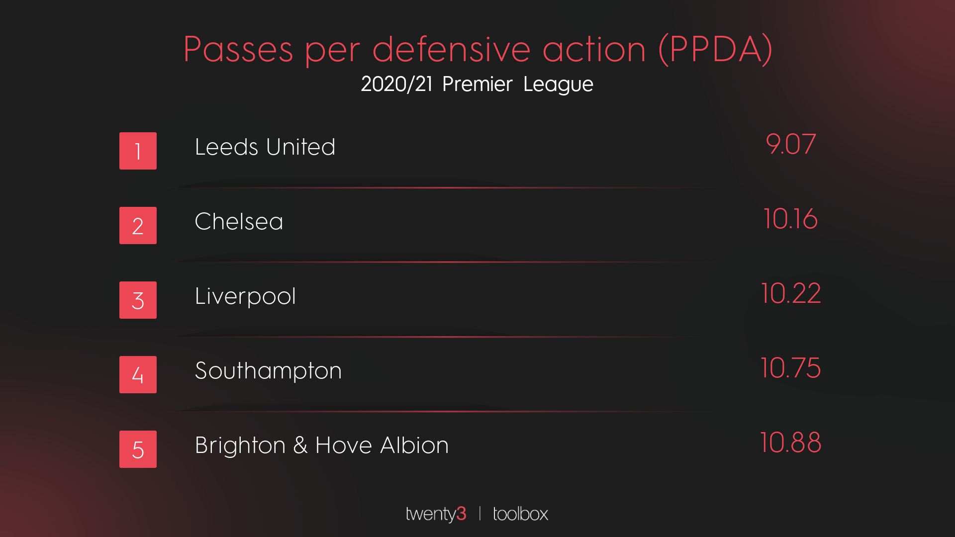
When pundits say a team changed their game, PPDA is the perfect way to back that statement up. During Southampton’s win over Liverpool in January, the hosts posted a PPDA of 21.25. Their season average is 11.76. Ralph Hasenhüttl’s side scored and early goal and then sat deeper than usual. Again, everyone who watched the game could see that, but it isn’t always easy to back that particular observation up. However, with the help of PPDA, you can see that they allowed almost twice as many passes before they looked to engage.
A lot of these metrics are just ways to quantify what you’re already talking about. The name is ultimately irrelevant, the definition and use of the metric is what is important.
All the graphics and visualisations in this article use Wyscout data and were produced in the Twenty3 Toolbox.
If you’d like to request a Toolbox demo for your organisation, you can do so here.