
The Best of the Twenty3 Toolbox: October

The Twenty3 Toolbox has been busy this October in what has been an action-packed month of football.
Jude Bellingham’s brilliant start to life at Real Madrid, Newcastle United’s Champions League exploits, non-league heroes and plenty of Premier League drama – the Toolbox has helped bring them all to life.
We picked a handful of our favourite examples this month from five of our Content Toolbox customers.
Sporting Life
We were very pleased to announce our partnership with Sporting Life yesterday – and they have already made excellent use of the Toolbox.
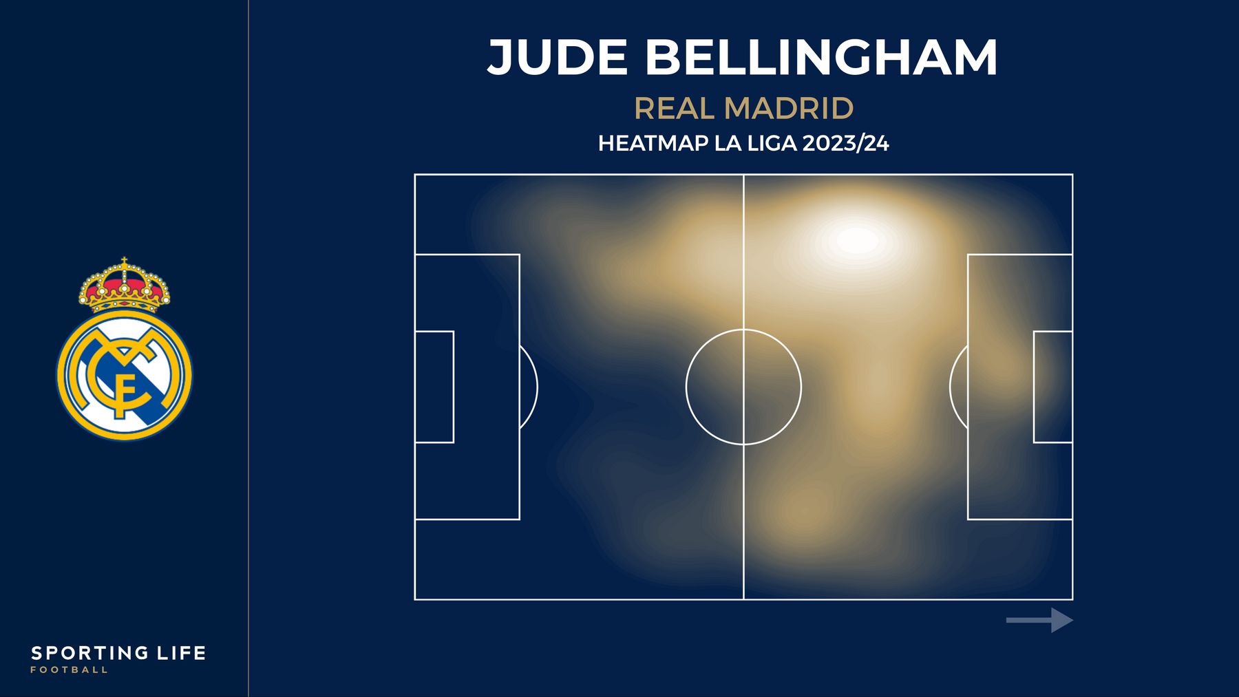
For example, this deep dive on Jude Bellingham’s fine form for Los Blancos uses a heat map to illustrate the scale of his influence on the side, accompanied by a shot map to draw attention to his hot streak in front of goal.

Similarly, Twenty3 alumnus Sam McGuire analysed Virgil van Dijk’s performances for Liverpool, highlighting his increasing busyness defensively and decreasing responsibility in possession with a player comparison radar and a pass map.


A whopping four graphics appear in this piece on Ollie Watkins’ evolution as a striker at Aston Villa, too. The visualisations used in each of the three articles aid the writers as they seek to give their readers greater insight into individual player performances.


Sporting Life have not only used the Toolbox to support player analysis, however. They have been taking advantage of the tool in their betting tips articles, such as this preview ahead of Newcastle’s Champions League clash with Borussia Dortmund in which our popular flank attacks visualisation features.

LiveScore
LiveScore regularly utilise Toolbox graphics in their articles.
These two examples are from a piece written by Twenty3’s Will Evans for LiveScore’s website on Fulham’s struggles this season, taking a closer look at the forwards Marco Silva has to rely on following Aleksandar Mitrovic’s departure this summer.


Additionally, ex-England international Joleon Lescott’s regular LiveScore column features two Toolbox graphics – he picked Pedro Neto and Cole Palmer as two of his five Premier League stars of Matchday 9.


Squawka
Squawka – a long-time partner – have employed Toolbox graphics to good effect on social media.
Our visualisations feature in a number of Squawka’s most successful posts this month, such as this heat map and stat card depicting Conor Gallagher’s industry out of possession.
Simplicity can be equally effective, as Squawka demonstrated with these sparse shot maps – which make very different points, but are both eye-catching.
There is plenty of variety in the graphics used on social media, with team passing network maps and player comparison radars also playing a part in these high-engagement posts.
Vanarama
Vanarama are another long-term client and their regular ‘Team of the Week’ graphics – made with the Toolbox – shine the spotlight on the best performers outside England’s top four divisions.
They also make use of an array of visualisations to zoom in more specifically on individual players, such as this shot map which highlights a sensational showing from Southend United’s Daniel Kanu.
William Hill
New Toolbox customers William Hill have continued to use graphics well in their social media posts.
This heat map depicts just how much time Harry Kane spent in the middle of the pitch for Bayern Munich in their recent 3-1 Champions League win over Galatasaray.
They also used a team stat comparison visualisation to preview Kane’s old club Tottenham Hotspur ahead of their trip to Selhurst Park to face Crystal Palace.
All visualisations in this article were produced with the Twenty3 Toolbox. For more information, please get in touch below.