
Release V: What’s new in the Twenty3 Toolbox

‘Tis the season of giving. With this in mind, we’ve given our Toolbox an update. Now, this is something of a regular occurrence, with our platform perpetually evolving, but this one – Release V – will help decide a number of family arguments tied to football that inevitably occur around this time of the year, with matches happening on what feels like an almost daily basis.
In addition to deploying a number of improvements across all of our tools, and some large-scale backend and infrastructural work to improve performance during peak data periods, we have introduced three exciting new visualisations to our already extensive ‘data viz’ portfolio.
First up, we have xG Race Charts.
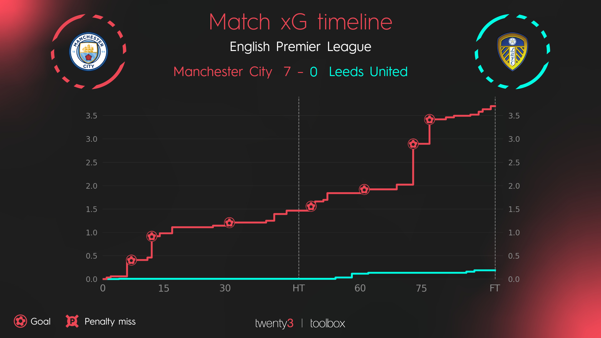


Scroll through the above carousel to view different matches
Simply put, it is a timeline of the expected goals for both teams in a single match.
This can help visualise how a game was played out at the business end of the pitch. Was a goal scored against the run of play? Did a team shut up shop after taking the lead? Did a team dominate possession but fail to fashion out any high-value opportunities? xG race charts may not be the definitive story, but they do tell an often very important – and interesting – narrative.
Next up, the Momentum Charts.


Scroll through the above carousel to view different matches
These essentially gives users a snapshot of a match, visualising the ebb and flow instead of just looking at an outcome.
We’re offering up two iterations of this.
The first one focuses on final third passes over the 90 minutes. The idea here is that the more passes into the final third, the more pressure a team puts on the opposition. It doesn’t necessarily indicate that a goal was deserved, but it does help to show if a goal was perhaps justified.
The second option focuses on Expected Threat (xT). A value is assigned to determine how likely it is a goal will be scored within the next five actions.


Scroll through the above carousel to view different matches
Again, this can be used to help differentiate between sterile possession and territorial dominance. You can, for example, pinpoint exactly when a team ramped up the pressure in the search for an equaliser or a match-winner.
For deeper analysis, users can then use this to investigate what might’ve changed during that period.
Finally, we have Squad Bar Charts.

A Bayern Munich example. The white lines show the highest single-match value for the relevant season
This visualisation shows how members of a team rank for a particular metric in a selected match or across the entirety of a campaign.
The beauty of this is that you can literally select any metric within the Toolbox. Users can see who attempted the most passes, who had the fewest number of touches and which player finished with the highest number of touches in the opposition’s box.
As an added bonus, the Football Lab now has a per minutes toggle. Previously, users had been able to look at totals and per 90 stats, but now they can see how often a player is having a shot, or scoring a goal, for example.

Other additions to this release include the ability to download keys alongside your viz export and opening up match selection across multiple seasons, meaning you can now cherry-pick games from a variety of seasons.
As is always the case with our visualisations, customers – whether Media or Pro – can of course take advantage of them in their very own colours and branding.
If you think the Toolbox could help your organisation either in the Media or Pro industry, please don’t hesitate to request a demo here.