
People like patterns: Introducing our xG timelines
It’s not often that school science experiments stick with you, or end up relating to football data, but this one clearly had an impact.
We, as a class, were faced with a series of numbers like this: 6 2 8 1 0 2 9 3 1 0 2 2 6 1. If you try and remember that, it’ll be a struggle. But rearrange and separate them like this — 1966 2018 2021 23 — and it’s a lot easier.
That’s because information is easier to process when we can recognise a pattern in it. A notable example of this in the realm of football data is radar charts. Radars can have a large selection of stats on them (Twenty3 users can go all the way up to 12), which is a lot of information to take in and contextualise. But if you use a sensible layout consistently, you begin to learn what shapes of radar indicate what type of player someone is.
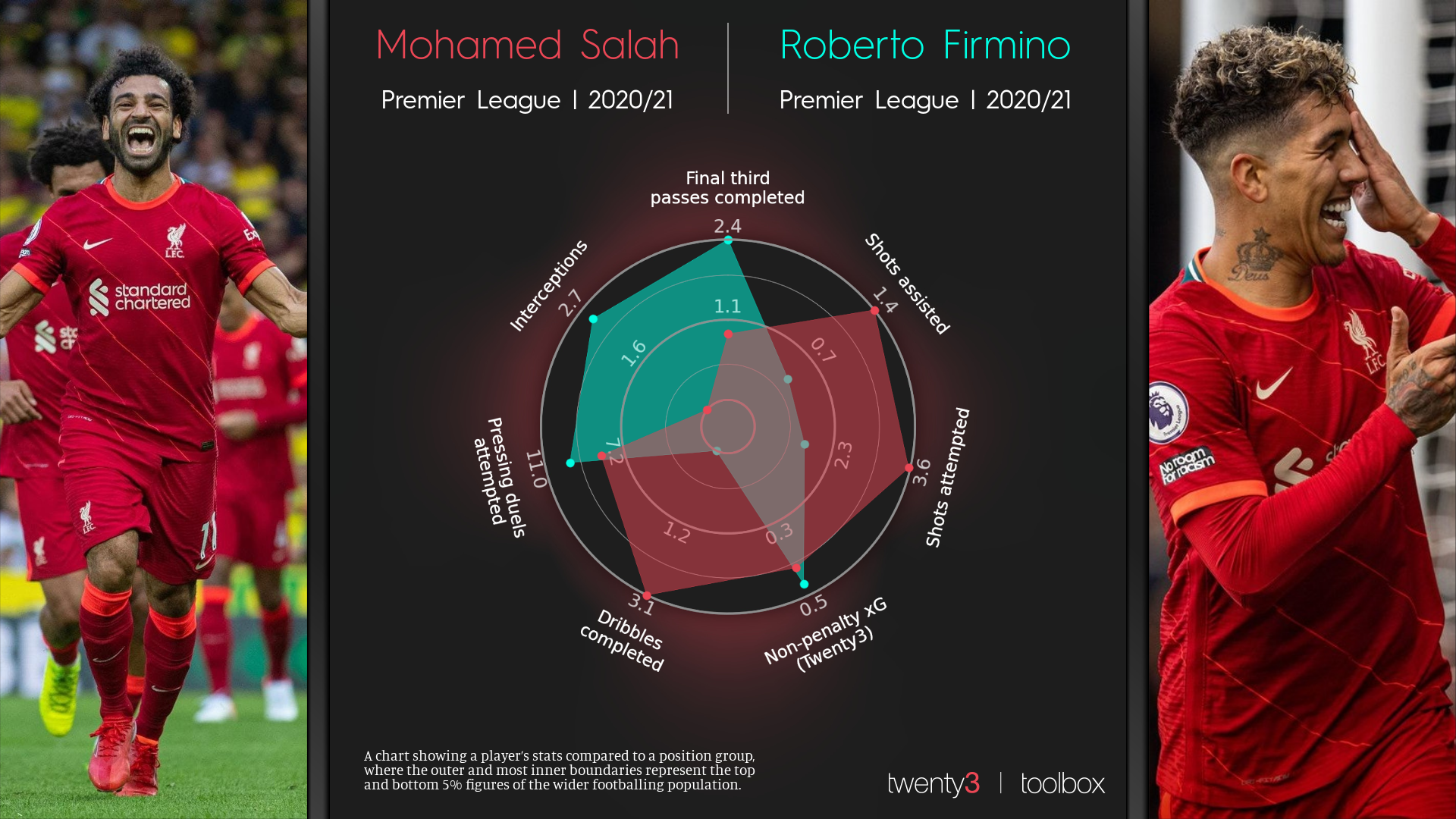
On the above radar, two pass-related statistics are next to each other, followed by two shot-based ones, then another attacking stat, followed by two defensive ones. It’s easy to see that Mohamed Salah has high figures for all of the attacking statistics while Roberto Firmino, relative to other strikers, has high build-up (final third passes) and defensive stats. If you put a different forward onto that template you’d be able to see in an instant whether they’re closer in output to Salah, or Firmino.
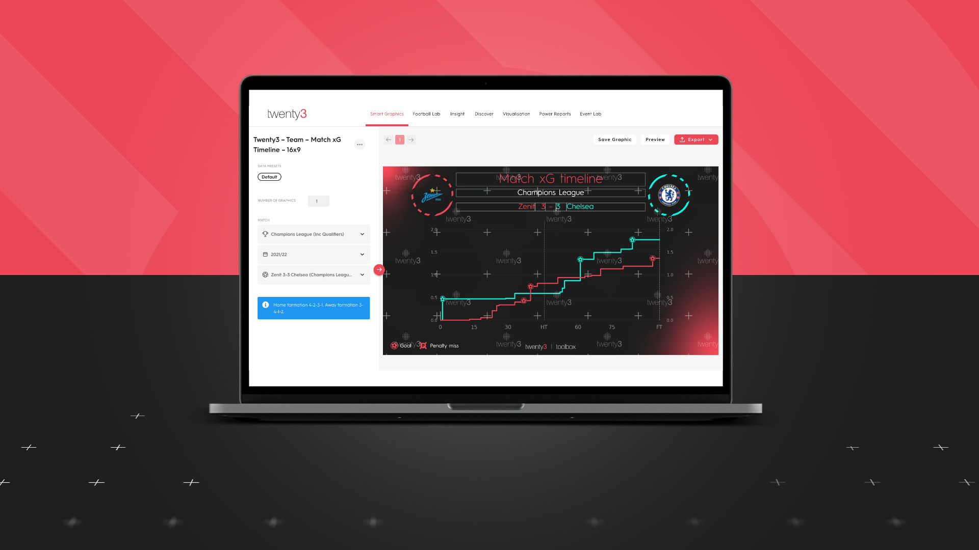
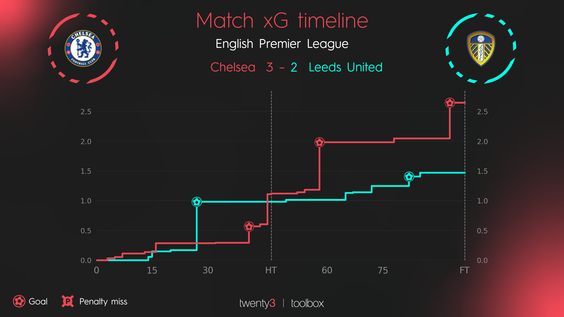
This is all a scenic route to talking about Twenty3’s expected goals timelines for matches. If you’ve not seen one before, the concept is simple — a line goes from left to right over the course of the match, and goes upwards depending on how much xG the team creates.
This is a visualisation that people might see a lot, something which can be produced easily after every match. And, because of that, people experience them in a similar way to radar charts.
When people read a chart, they generally go from looking at the title to looking at the data. The amount of time they spend reading the axes is usually pretty low.
When designing our xG timeline charts, we took the view that if the y-axis always and only represented the highest xG value of the two teams, this could be subtly misleading. The size of each step indicates the quality of the chance, with ‘large step = great chance’ a rule that a reader should pick up quickly.
But if the match is a low-chance, low-xG affair, relatively average chances could be given a large step, making them look better than they were. This is why we took the decision that each xG timeline chart would go up to 2.0 xG (at the least).
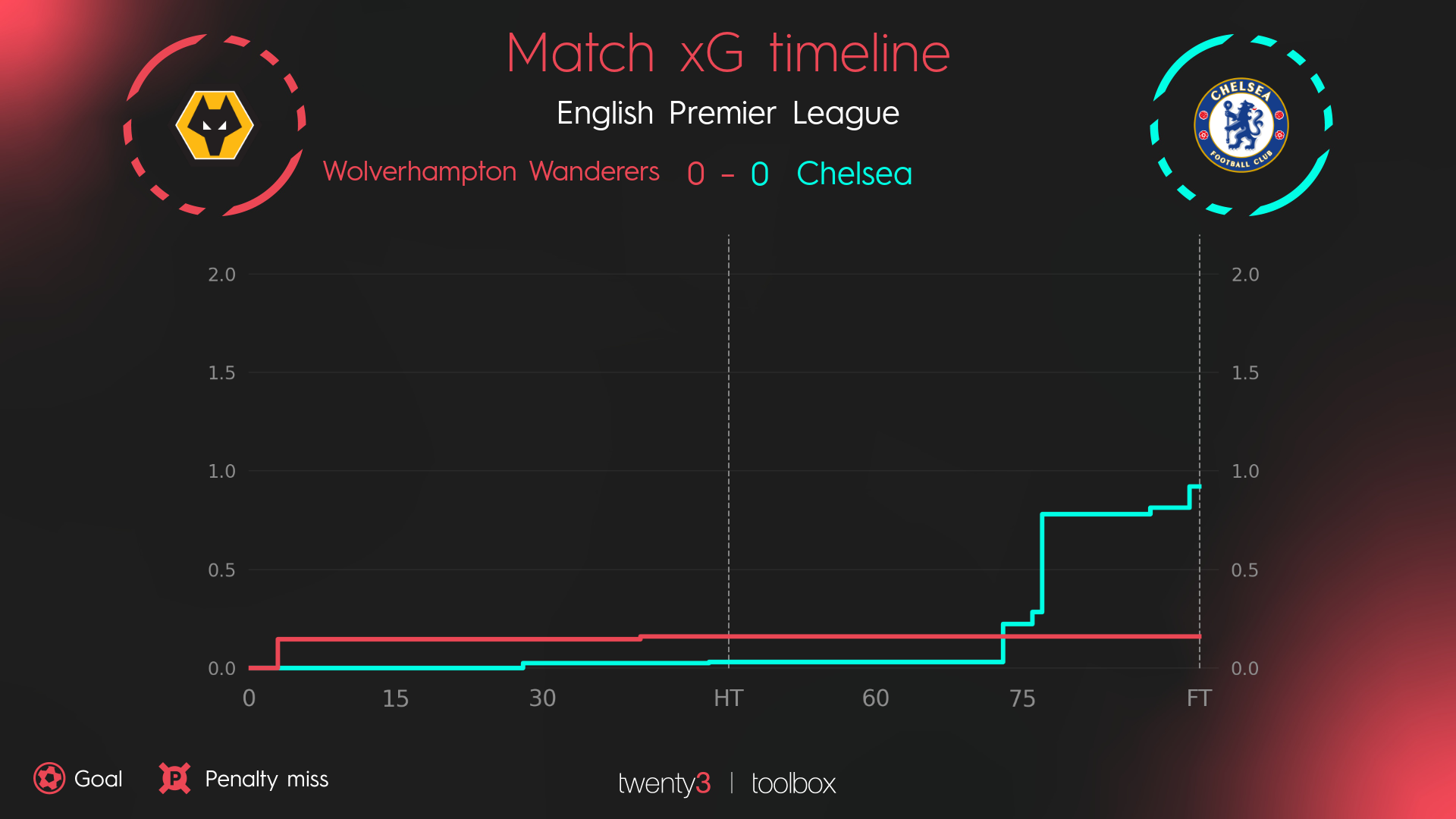
Although the y-axis can, of course, go above 2.0xG if a team has a good match, this helps give a bit of uniformity to these visualisations. A match where both teams have a poor or mediocre attacking performance clearly looks like it, rather than the least-worst team heading to the top of the chart.
This one small decision should mean a single glance gives readers a consistent sense of what the visualisation means. Useful for any chart, but particularly for one that fans like to turn to as a summary of each game.
All the graphics and visualisations in this article use Wyscout data and were produced in the Twenty3 Toolbox.
If you think the Toolbox could help your organisation either in the Media or Pro industry, please don’t hesitate to request a demo here.