
Introducing Twenty3’s Dynamic Radars

In February 2013, Rami Moghadam pushed a domino that would change football. Rami Modhadam was, is, a designer and art director. And the domino was in basketball.
Ted Knutson, of StatsBomb (then: blog, now: company), saw Moghadam’s radar charts and, along with Nat James’, applied the design to football.
Although radars had been seen in Pro Evolution Soccer and Football Manager before then, it’s Knutson and James that caught the imaginations of a burgeoning analytics community and have spawned many reproductions and more than a few careers.
Radars are a neat tool. So it’s only natural that they’re coming to the Twenty3 Content Toolbox.

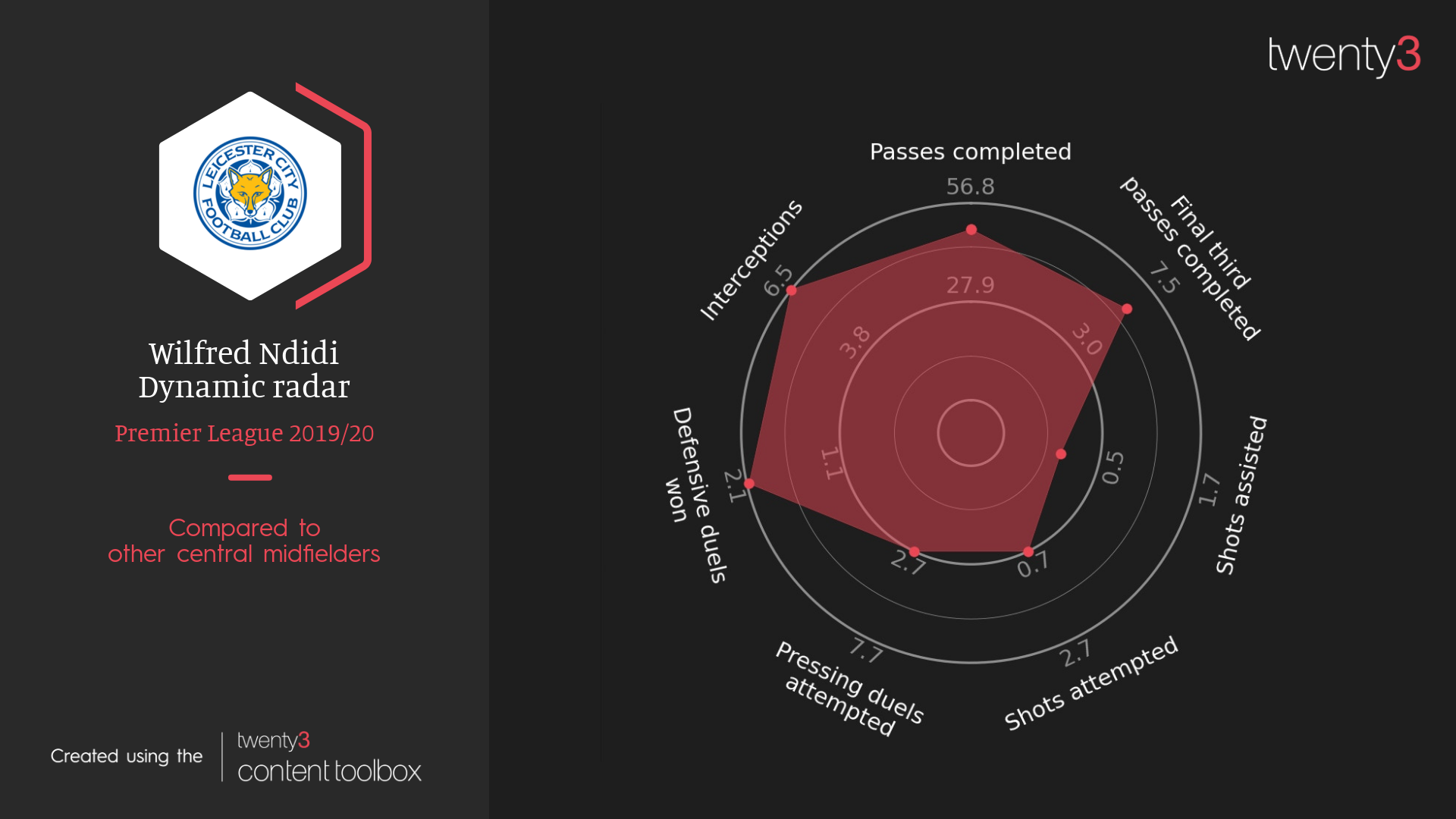
A radar chart is simply a way of showing numerous pieces of data in one place. It’s prettier than a table, and if you use the same stats in the same places then it can be quicker to read as you learn to pick up on the shape.
In the example above, going clockwise from the top, there are two passing stats that are followed by two shot-based stats (one of which is also a passing stat) and then three defensive stats.
Whereas Paul Pogba is a player who passes a lot and is involved in shot creation, Wilfred Ndidi is easily identifiable as a more defensive central midfielder.
The upper and lower boundaries for each stat mark the top and bottom five per cent. The reason for the top/bottom five per cent is that, if you used the absolute best and worst figures in a database, someone like Lionel Messi would make everybody else look like chumps.
Technically speaking, these boundaries will be the top/bottom five per cent of Europe’s five major leagues over the last three seasons. Meaningfully, though, they’re just markers of what ‘really good’ and ‘really bad’ looks like. The middle is average.
The stats on the radars above aren’t the only ones available, though. Our dynamic radars are set up to take any statistic from whichever data provider you choose from. These happen to be using Wyscout data, but Twenty3’s Opta customers (for example) will be able to use these too.
And, within reason, you can choose how many stats to put on the radar yourself.

I may have talked before about the challenges that are involved in designing visualisations for Twenty3, where we want things to be as flexible as possible. If I haven’t, let me do it again because my bosses read these.
Our visualisations need to be able to be used across many different use cases and many different brand themes. They need to look good in reports, within articles, on social media, so the amount of information on them is an important balance to strike. What is essential? What isn’t?
The shape is essential. The stat names are essential. Where the player’s stats fall compared to other people is important, and more important than what the actual numbers are. Some real figures are nice to have, which is why we’ve included them, but you can turn them off if you want.


Examples of the dynamic radars in different colours, and with numeric labels turned on or off
Existing customers will see these in the Toolbox soon. Everyone else… well, you’ll probably see them around as people start to use them.
The general hope is that people like them. My specific hope is that, with the flexibility we’ve worked into them, different places will be able to make them their own. That they’ll target their uses to their needs, capture even more imaginations, and the dominos that a basketball-loving designer started off by nudging will continue to fall.
If you’d like to learn more about our dynamic radars, other data visualisations, products, or services, and how they might be able to help you, don’t hesitate to get in touch.