
Bringing the game to life with Twenty3’s visualisations

If you’re reading this blog post, you’re probably someone who likes, or is at least intrigued by, football data. If so, you’ve made a good choice.
You’ve made a good choice because now you get a peek at the work we’ve been doing at Twenty3 to make data visualisations (a many-syllable way of saying pretty graphics) even better.

Here you see Erling Braut Håland’s shots for Dortmund this season, which were taken first-time and with his left foot. It tells you two things. The first is that this young Norwegian has unerring accuracy and that the goalkeepers of the Bundesliga might need to form a support group to cope with facing him.
The second is that “wait, you can make that?!”

Football data in its raw, unrefined form can be incredibly rich in detail but also incredibly difficult to work with. The blessing of such a fluid sport in what it gives as a spectacle becomes a curse when trying to deal with the numbers.
That’s why we’ve worked hard to open it up to you in our Content Toolbox. You should be able to access the nuances of the data that the data companies are collecting rather than just the surface-level scraps here and there.
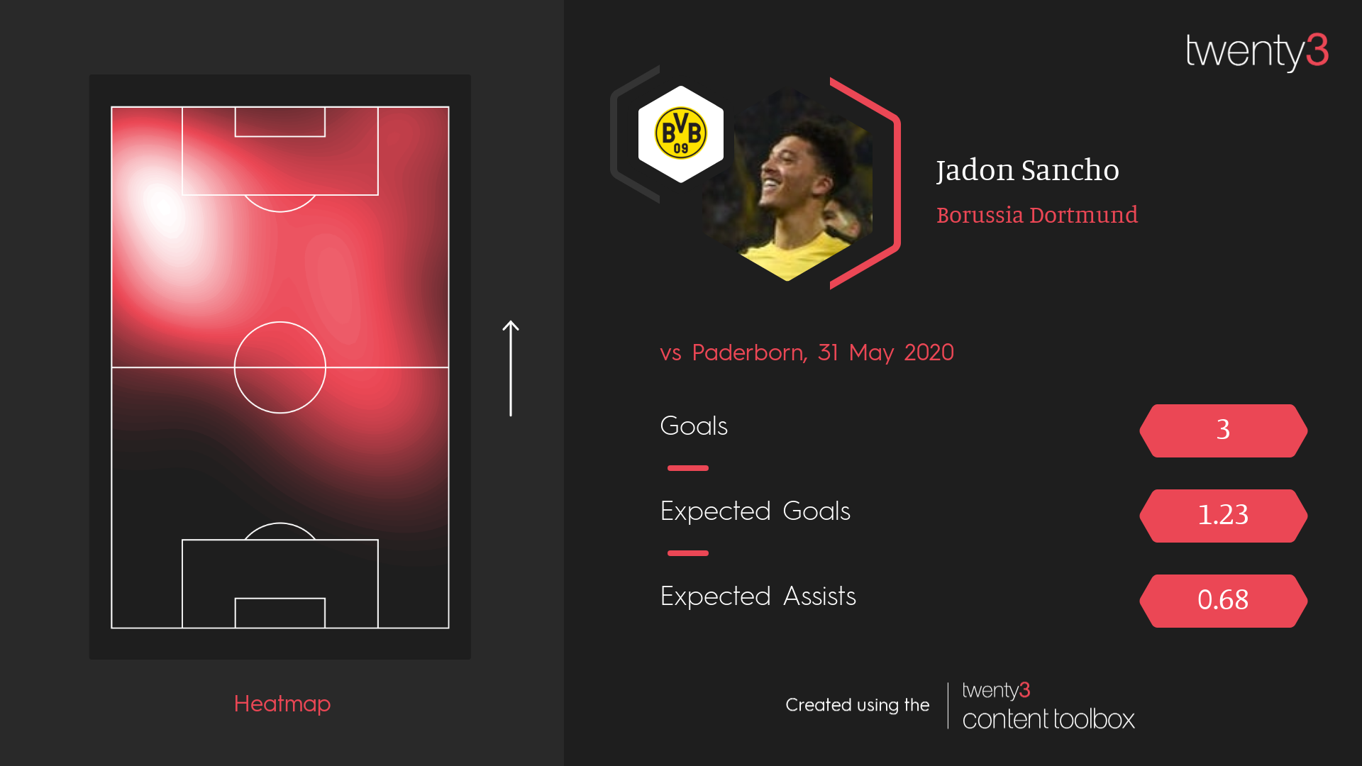
The encapsulation of this is something like a heatmap. As it’s commonly used, a ‘heatmap’ is a way of showing a player’s actions on the pitch, with areas where they’re more active showing up brighter than others. Here is Jadon Sancho’s from Dortmund’s 6-1 win over Paderborn in May:
These ‘ready-made’ heatmaps come from a defined set of on-ball events that players make, but why not open it up so people can show any type of action?
My favourite example of this is “Liverpool’s Trent Alexander-Arnold map” – or, to be more accurate, a heatmap of where Liverpool have crossed from this season.

Visualisation types like heatmaps are now, thanks to the Toolbox, as powerful and rich as the data coming from the providers, which is very rich. Posh and Becks-level rich. Lionel Messi-level rich. Speaking of, when Messi gets his direct free-kicks on target, here’s where he puts them.

Importantly, these visualisations are all as simple to make as each other; there’s no point providing these options if they’re a pain to actually use. You can use the Smart Graphics tool to knock up something audience-ready, pulling in the vis alongside data-in-numbers-form if you want, or just play around to your heart’s content exploring the visualisations themselves.
There are far more options than we’ve shown here too: position the player was playing in, formation of a team, formation of their opponents, home or away, first half or second half of matches…
And the point of all this?
If you’ve come to this blog post because you like, or at least are intrigued by, football data, you’ve already half-won the battle. You already know that using it gives you another string to your bow at work, whatever that work may be: social media, written content, video content, professional analysis. It’s extra information that gives you a hand in doing better work, and in doing better work quicker.
We want to help you make that better work even better, even quicker, even easier. That’s the next half of the battle. And the Toolbox is one hell of a weapon.
If your interest has been piqued by this article and you’d like to learn more about the Twenty3 Content Toolbox, don’t hesitate to get in touch.