
Exploring Twenty3’s new Momentum Visualisations
Football has come a long way.
Less than a decade ago, narratives were shaped by how many shots a team racked up combined with the percentage of possession they’d had during the match. Then the expected goal (xG) metric was introduced and it helped paint a much better picture of a game. After all, quantity isn’t tied directly to quality. A team may have fewer chances throughout, but their opportunities could be high-value ones.
But, while xG – by effectively assigning a value to chances – is very useful, it doesn’t tell the full story of a game. It doesn’t factor in all of those opportunities that don’t end in a shot.
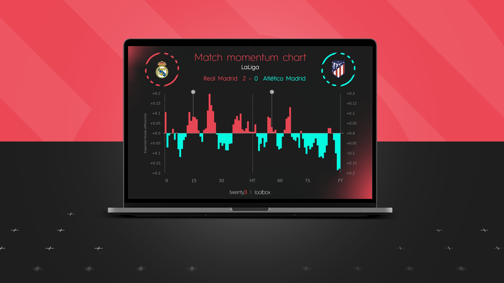
With this in mind, we’ve introduced Momentum Charts to our Content and Analytics Toolbox in our latest release. A key feature this new visualisation is expected threat (xT), very much one of the metrics of the moment.
David Sumpter has explained the concept of xT in detail previously:
“If a player makes a pass which moves the ball from a place where it is unlikely for their team to score, to a place where they are more likely to score, then they have increased the xT in favour of their team. In general, the nearer you get the ball to the goal the more likely your team is to score.”
This essentially gives users a snapshot of a game and helps visualise the ebb and flow of the match instead of only looking at an outcome.

For example, Newcastle’s recent victory over Burnley really burst into life in the final half an hour after a fairly even opening 45 minutes, with the home side looking to kill the game off and the away team hoping to salvage something.

The Merseyside derby was a different story entirely. Liverpool were a threat from minute one and had the momentum for basically the entirety of the 90 minutes.
As well as xT, the new visualisation allows users to measure threat in a second way – by looking at a rolling average of final third passes. Again, this helps tell the story of a match in greater detail.
It helps highlight sustained pressure; this gives users – particularly in the media – the power to properly show a smash and grab result compared to a deserved one.

Manchester United, under new boss Ralf Rangnick, started with real intent against Crystal Palace.
They dominated the opening 60 minutes and kept probing in a bid to break the hosts down. However, their goal arrived when Patrick Vieira’s side had started to journey into the opposition’s final third with greater regularity.

Aston Villa scored, and conceded, while on top in their victory over Leicester City. Steven Gerrard’s men ventured into the final third sparingly in the opening 60 minutes and scored after sustained pressure.
The away side, on the other hand, huffed and puffed but could not find a way past Emiliano Martínez for a second time despite being on top in terms of territorial dominance.
These new additions to the Toolbox provide more context which then helps piece together more of a thorough picture by encompassing a number of key, game-defining metrics.
As ever, these visualisations can be fully customised to the branding and colour scheme of any of our customers.

Sign up to our monthly newsletter
All the graphics and visualisations in this article use Wyscout data and were produced in the Twenty3 Toolbox.
If you think the Toolbox could help your organisation either in the Media or Pro industry, please don’t hesitate to request a demo here.